The Button control responds to a click from the user and is used to initiate or confirm an action. Familiar examples include the Submit and Cancel buttons used on web forms.
Be sure to check out the Unity Button component, and the Material Design Guidelines on Buttons and Floating Action Buttons.
A floating action button (FAB), rectangular button, and icon button.
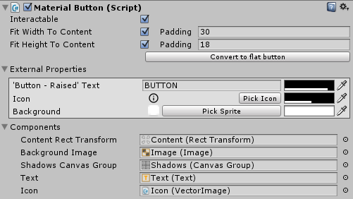
A MaterialButton in the inspector.
Properties
| Property | Function |
|---|---|
| Interactable | Will this component accept input? - Controls the 'interactable' setting on the attached Button component. - Controls the visual alpha and shadow state of the button. - If you wish to disable button input and apply custom visuals, you can toggle 'interactable' on the Button component and manually apply the visuals. |
| Fit Width To Content | Should the button fit its width to match the content width + x padding? |
| Fit Height To Content | Should the button fit its height to match the content height + y padding? |
| External Properties | A collection of convenience properties that get or set properties belonging to objects relating to this component. |
| Content Padding | The padding between the content and edge of the button. Used when fitting the button to the content size. |
| Content Rect Transform | The RectTransform of the button's content. |
| Background Image | The graphic representing the button's background. |
| Shadow Canvas Group | The shadow canvas group. |
| Text | The button's text. |
Details
Coming soon!