When creating games and applications for various devices, making sure that your UI looks consistent and scales well between screen resolutions, aspect ratios, and pixel densities can prove to be a challenge. Fortunately, MaterialUI is designed with this in mind, providing components that are able to look pixel-perfect on a variety of different displays. Here are some tips to get the most out of MaterialUI’s scaling features.
Each root canvas containing MaterialUI components will need the CanvasScaler and MaterialUIScaler attached, as they are used for many MaterialUI elements. It is recommended to read the documentation on the MaterialUIScaler component.
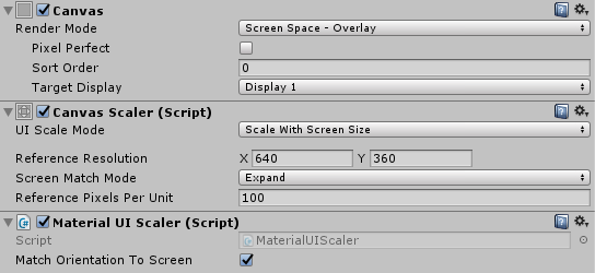
A Canvas, CanvasScaler, and MaterialUIScaler in the inspector.
Mobile Devices
When designing for mobile devices, it’s usually best practice to use the ‘scale with screen size’ mode in the CanvasScaler, as it’s able to scale more reliably (less blurry) than the ‘constant physical size’ mode.
MaterialUI’s components are designed to work well at any scaling level, as most assets are vector-based, and applicable sprites include a 100%, 200%, and 400% scaled version. However, they are sized to ‘feel right’ on mobile devices when a reference resolution of 360×640 (when in portrait. Flipped when in landscape).
Icons
MaterialUI comes with a font-based icon system that allows you to use vector icons in your projects, cutting down on filesize and improving scaling quality. Rather that having blurry sprites at varying scales, or having to include multiple sizes of the same sprite, you can simply use a VectorImage which will scale perfectly to any resolution.